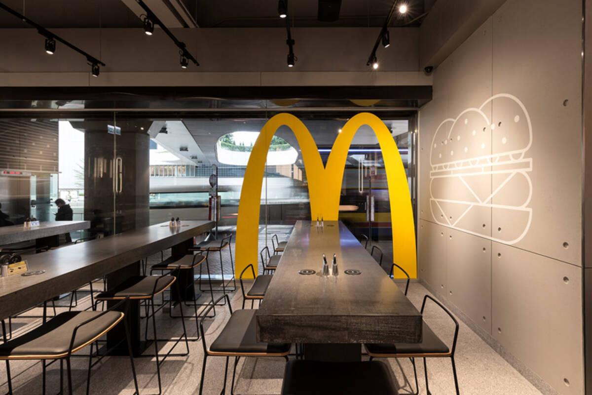
McDonald’s today looks like the “modern” coffee shops at airports like 10 or 20 years ago.
Yeah, it’s the expensive of 20 years ago. It’s still chic, because we had a monotone crazy at the 00s, just like we had a plastic crazy in the 70s. It’s starting to look tired right now, so expect those places to stop using those soon.
Personally, I do prefer colors, but they are harder to get right, and both examples on the post are horrible. Also, they will probably “upgrade” to some tasteless “rococo” next that won’t be any better. At least the tasteless monochrome is less imposing than those other ones.