

I did look within the health app, but I do not find the interface hierarchy to be at all intuitive, and it’s very difficult to locate relevant information.
I did look within the health app, but I do not find the interface hierarchy to be at all intuitive, and it’s very difficult to locate relevant information.
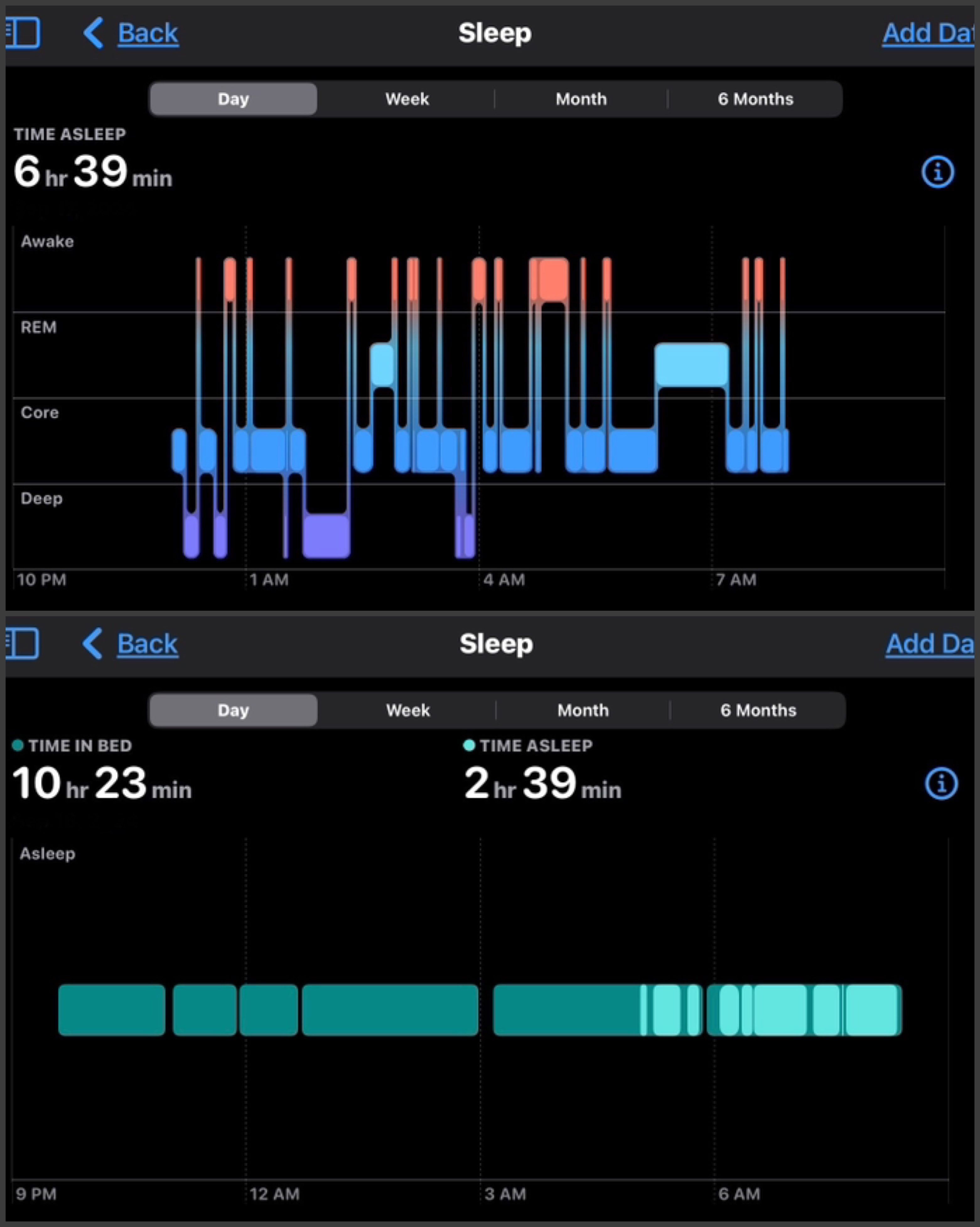
Ok, if its the same person with sleep apnea and two different days, then what you’re looking at is two different data views or visualizations.
The top graph is more detailed, showing many different sleep states in detail, while the bottom is a more general, summarized view of just ‘in bed’ vs ‘good quality sleep’.
Probably the bottom graph is showing a more dull green for just being in bed vs the brighter green showing either just deep sleep, or core sleep plus deep sleep.
Somehow an option has been changed so that now you’re getting the simplified/summarized view.
I agree, except it seems like which view is displayed on a given day is random.