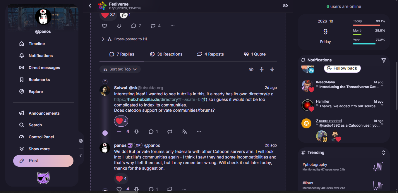

Today I merged many UI changes, mostly around how threads are viewed and navigated.
I took some of the good elements of Reddit, so now we have sorting by Old/New/Top (the default for the microblogging timelines is Old, and for forums it’s Top - both can change in settings) and a flexible replies section with collapsible/expandable branches.
Top-level posts now show the total number of replies under the whole thread, not just the direct/first level replies (but again you can change it back in Settings). I also saved much vertical space, so now you can read long threads with less scrolling.
If I may say so myself, I honestly believe it’s one of the best UIs on fedi, especially for reading conversations. I think that if anyone tried it, they would agree. Really, really happy with the results. It’s still fresh, so I will probably refine things here and there, but it’s pretty much exactly as I envisioned it.
Let us know what you think!
#catodon
You must log in or register to comment.
nice! i might take some inspiration for my hubzilla SPA theme.
You create theme ? :)
yes, i’ve made some php based themes earlier(https://github.com/saiwal/Utsukta-hub-themes) but now a modern UI for hubzilla based on solidjs, visit my profile to see.
Very cool :)
On solidified, there is a focus box in the right panel. What it does ?
the right panel is for notifications (when logged in) and widgets for the page you are visiting. I’m not exactly sure what you mean by ‘focus box’ but it might be a widget(category/tag filter).

I’m interrested on the focus box on the right with the start and resset button. There is the number 25 on it.
I’m curious to see what it does because piefed has something similar. we can define a time limit. So the box gave me some idea, that we could define time limit, then start it. I even have a wild one, nuking the CSS ! So we are forced to take a break. :3
oh thats are pomodoro timer. a countdown timer widget also exists that the user can place where they want. the layout is editable by the user.
Currently they dont do anything on expiry but your idea is interesting, a countdown timer that makes you take a break from being online ;)
Interesting, we should compare the various UI and get inspired by them. ^^
From Reddit i like their horizontal pinned post, it takes less place.
For, collapsible thread, we will see. I think we can improve lenthy menu, but how ? That’s quite hard :)
i would also suggest designers to be aware to not adopt dark patterns that are widespread in corporate platforms https://datafield.dev/algorithmic-addiction/
Thank, that’s a long book, but i saved it. Imho, wikipedia has a good design that repell dark pattern. :)