What we have is a methodology for measuring purchasing power, that is, the ability to buy things. This is superior to a methodology of measuring spreadsheet numbers (which is what money is in the modern world), where the numbers are measuring non-equivalent quantities.
Currency exchange rates are not objective, they are pegged specifically to international trade, not domestic. So if I have 1 dollar and you have 1 yuan, the exchange rate tells me how many dollars you can buy and how many yuan I can buy. What it doesn’t tell me is what is the average grocery bill in China and what is the average grocery bill in the US. It doesn’t tell me the average cost for a KwH in China versus the US.
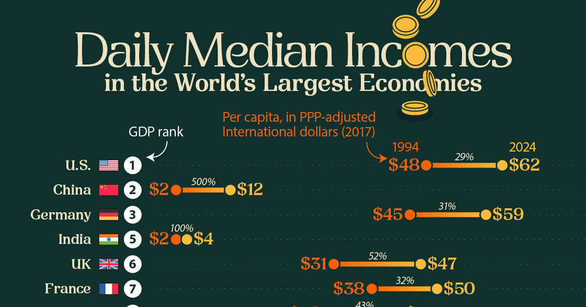
What we want to know, economically is not who has more fiat currency in their cash flow. We want to know who is better able to feed their kids using their income.
This 500% increase would be perfectly understandable if we said “carrying capacity of Chinese households increased by 500%” because it’s relatively clear we can measure that. The comparative nature of the problem is obvious - the basket of goods for household carrying capacity is potentially different based on country. But the fundamentals are the same: shelter, calories, hydration, fitness, medicine, clothing, education, etc. Chinese people are able to obtain 5x more of this basket than they used to be able to.
Meanwhile, I am sure you are familiar with how it’s going in the US
So what’s the correct interpretation of this graphic when comparing between countries? Is it supposed to say that Americans can afford 5 times as much stuff? That doesn’t seem right to me, so how come these PPP adjustments don’t bring China closer?
So you trust the IMF, World Bank and OECD to crunch the numbers on PPP? You trust the company “Visual Capitalist”? They torture numbers into pretty images for money and are proud to have done so for Black Rock, Goldman Sachs, JP morgan and Guchi to name just a few of their “partners.”
Forget the numbers for China for a second, Do you actually believe that american households had 29% increase in their wages compared to living standards over the last 30 years? As you said we all know how america is doing and the trend over the last 30 years is not upwards.
Again maybe china has a 500% increase in wages adjusted to cost of living but maybe it is closer to 1000% or maybe it is only 300% but usa is negative 30%.
I don’t trust the methodology of the infographic. I especially do not trust a single person involved in the production of these numbers and the more I look into it the more I am convinced that nobody should.


What we have is a methodology for measuring purchasing power, that is, the ability to buy things. This is superior to a methodology of measuring spreadsheet numbers (which is what money is in the modern world), where the numbers are measuring non-equivalent quantities.
Currency exchange rates are not objective, they are pegged specifically to international trade, not domestic. So if I have 1 dollar and you have 1 yuan, the exchange rate tells me how many dollars you can buy and how many yuan I can buy. What it doesn’t tell me is what is the average grocery bill in China and what is the average grocery bill in the US. It doesn’t tell me the average cost for a KwH in China versus the US.
What we want to know, economically is not who has more fiat currency in their cash flow. We want to know who is better able to feed their kids using their income.
This 500% increase would be perfectly understandable if we said “carrying capacity of Chinese households increased by 500%” because it’s relatively clear we can measure that. The comparative nature of the problem is obvious - the basket of goods for household carrying capacity is potentially different based on country. But the fundamentals are the same: shelter, calories, hydration, fitness, medicine, clothing, education, etc. Chinese people are able to obtain 5x more of this basket than they used to be able to.
Meanwhile, I am sure you are familiar with how it’s going in the US
So what’s the correct interpretation of this graphic when comparing between countries? Is it supposed to say that Americans can afford 5 times as much stuff? That doesn’t seem right to me, so how come these PPP adjustments don’t bring China closer?
Yeah an apartment in a major city in China costs like 2 years wages where in usa it is like 20 years wages.
So you trust the IMF, World Bank and OECD to crunch the numbers on PPP? You trust the company “Visual Capitalist”? They torture numbers into pretty images for money and are proud to have done so for Black Rock, Goldman Sachs, JP morgan and Guchi to name just a few of their “partners.”
Forget the numbers for China for a second, Do you actually believe that american households had 29% increase in their wages compared to living standards over the last 30 years? As you said we all know how america is doing and the trend over the last 30 years is not upwards.
Again maybe china has a 500% increase in wages adjusted to cost of living but maybe it is closer to 1000% or maybe it is only 300% but usa is negative 30%.
I don’t trust the methodology of the infographic. I especially do not trust a single person involved in the production of these numbers and the more I look into it the more I am convinced that nobody should.
Real convenient how westerners start disbelieving western sources as soon as they’re in consensus with AES adjacent sources
what AES adjacent source is saying that China’s wages have increased exactly 500% over 30 years?
This graph was created by people who worked for Black Rock, Goldman Sachs, JP morgan and Guchi they are not an AES adjacent source.